Sunday, February 27, 2011
The playground art of Daniel Dove
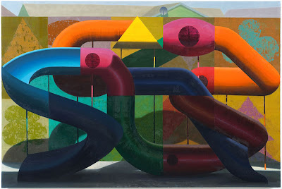
Daniel Dove kindly responded to my query about why he uses playgrounds in his art, answering that in addition to their general appealing colors and shapes they also bear a structural resemblance to mid 20th century Abstract Expressionism ala Jackson Pollock, Joan Mitchell, Willem DeKooning, et al. with their all-over pipes and slides; structures that are also, in his words "the closest thing in the built environment to a human body, and given that I started my painting life as a devoted figurative painter, I am attracted to that anthropomorphic quality. I sometimes think of the pipes as intestines or limbs."
As anyone who has visited a McDonald's playground knows, these playgrounds "manifest a hyperbolic glee that I associate with consumer culture and advertising. They are so aggressively joyful-looking that they tend to become parodies of themselves, reaching a critical glee-mass that collapses into irony. I hope to capture some of this in my paintings."
This is especially true of the plastic playgrounds he depicts, which he gravitates toward "because plastic ages so badly and awkwardly, as opposed to metal or wood which acquires a patina of 'authenticity'. I like the awkwardness of used plastic. This is why the playscapes in my paintings usually have a kind of distressed or vomited-on quality, like a birthday party gone slightly awry. Once again, there is a certain ironic aspect to this, and perhaps a (gentle) commentary about the disposability of the contemporary built environment."
Ultimately, he uses the playscapes to combine both abstract and realist conventions in his paintings, in "all-over" compositions that fill the canvas with color and form. It strikes me that this is how a child sees a playscape: with it filling their eyes all over.
[from top to bottom above are Exploded View (2009), Funland 1 (2008), Overlap Version 1 (2005), Precita Playscape (2010), and Playscape (2005)].
Subscribe to:
Post Comments (Atom)


No comments:
Post a Comment